
With an era of minimalism in the age of information and sci-fi-vision-tye AI-futuristic imagery, one might quickly assume retro looks are so passé. But in a stroke of irony, retro look is back full circle—and not merely in fashion and home decor, but in branding. Industry after industry, today’s businesses are embracing retro visual look to generate emotional resonance and cut through an increasingly crowded marketplace.

But why does retro style endure—and how do brands reimagine the past for the future?
Let’s explore how retro looks are informing 2025 modern branding.
Why Retro Works: Emotional Resonance Meets Timeless Appeal
Retro design possesses one of its greatest strengths in that it can be evocative. From the 70s’ dramatic type, the 80s’ palette of muted pastels, or the 90s’ grunge textures, old-school design is capable of tapping into common memory.
✦ They don’t just look familiar—these things feel familiar, with comfort, truth, and storytelling possibility.
In an era in which human consumers crave brand familiarity and authenticity, retro graphics are not a trend—a it’s a strategy.
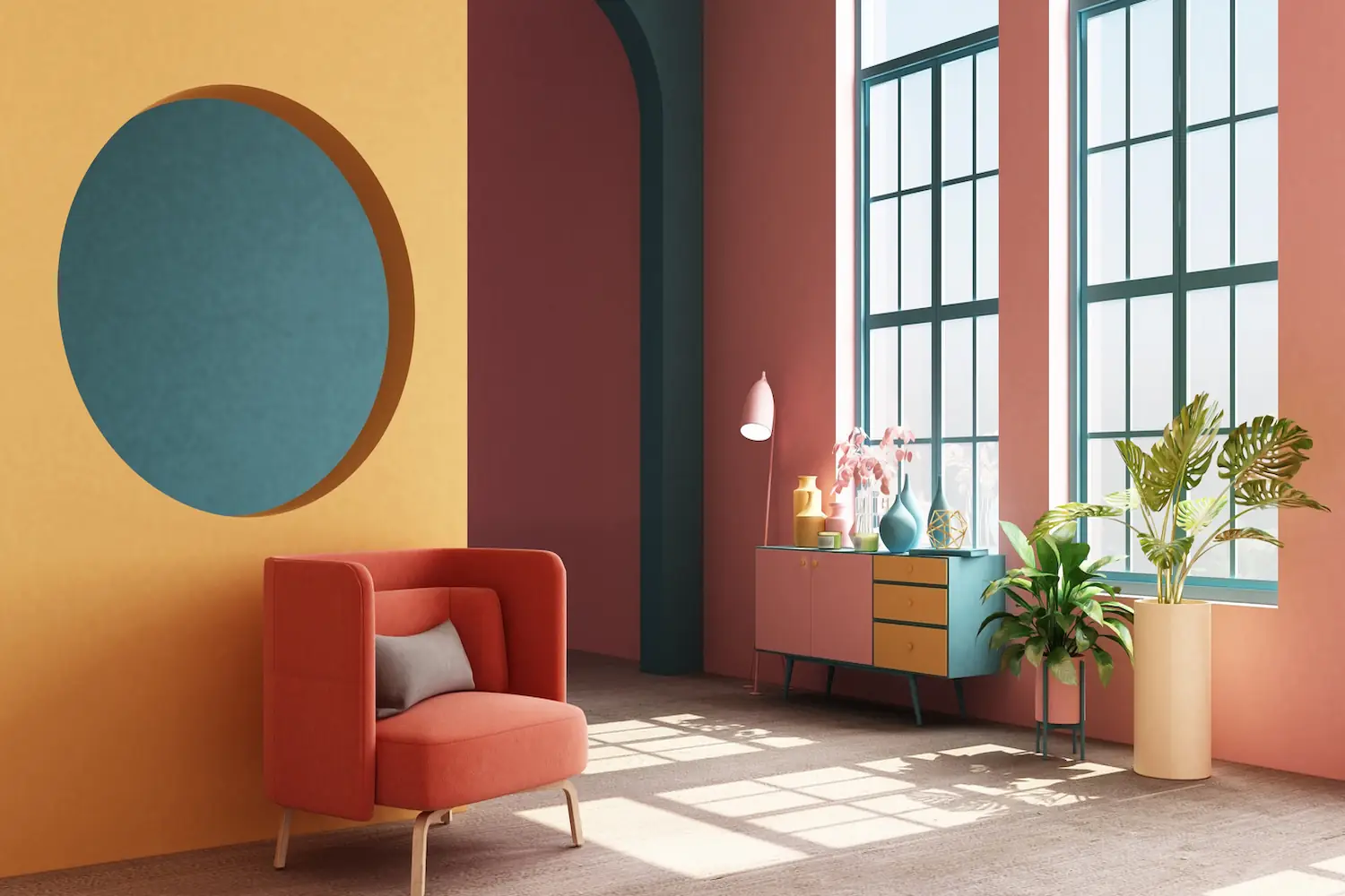
Color Palettes That Speak of the Past (With a Modern Twist)
Retro branding also incorporates bold color combinations seen by eye. Burnt orange, mustard yellow, worn teals, and muted browns are the typical culprits. But in 2025, designers are merging those retro hues with new gradients and softer textures.
✦ The end result is visually reminiscent of the past but still refined—perfect for modern platforms and high-definition displays.
Typography: The Hero of Nostalgic Branding
Where retro vibe is on the line, typography takes center stage. Fonts with hand-painted sign, neon diner menu, and 90s punk zine feel are being reinterpreted—but with a twist.
✦ Imagine serif-rich headlines, blocky letterforms, and cheerful ligatures—balanced with neat sans-serifs for screen readability.
Burger King, Mailchimp, and Glossier are merely a few of the brands that have employed this typographic strategy to build identities that are bold, memorable, and pleasantly fresh.
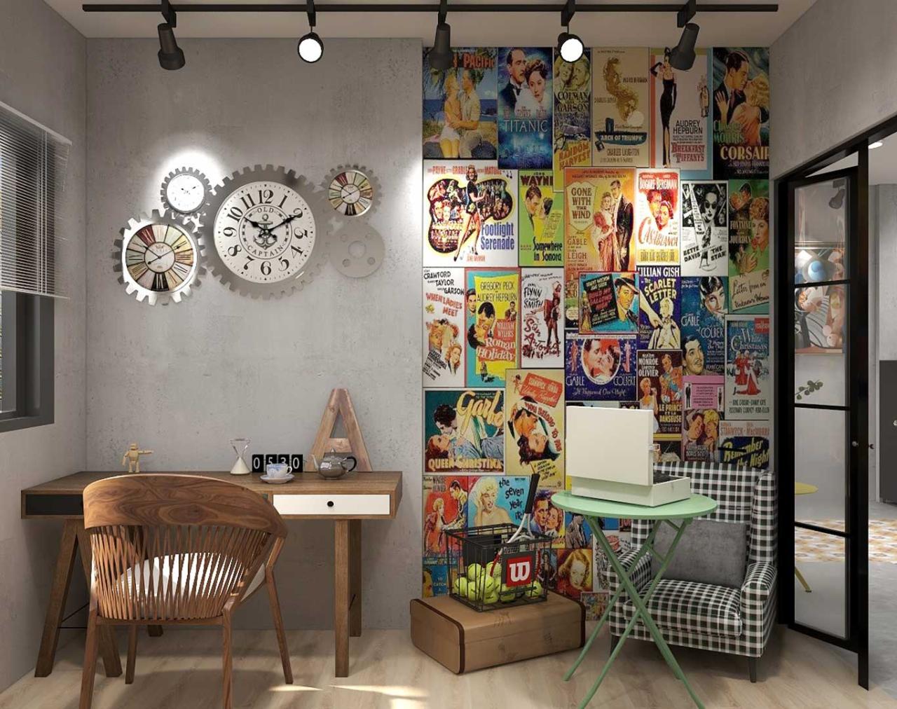
Texture, Grain, and Analog Layers
The easiest way to throw a design back in time is to invite the tactile flaws on board. Grain overlays, paper textures, halftones, and distressed prints provide depth and dimension—adding a hint of handmade authenticity to digital work.
✦ All these effects provide a nice counterbalance to the crisp edges of new tech, creating a “perfectly imperfect” brand identity that’s human and timeless.
Logo Revivals and Heritage Branding
In a bit of irony, some brands are returning to their classic logos or early brand appearances—not necessarily out of respect for history, but to tap into built-in nostalgia. Pepsi, Kodak, and even Instagram have incorporated retro elements into their visual identities.
✦ The revival reminds individuals about a brand’s history, faithfulness, and emotional capital—and especially suits brands with multi-generational bases.
Vintage, But Make It Digital
While retro aesthetic glances in the rearview mirror, it must also deliver now. Businesses of 2025 are combining retro aesthetics with digitally smart designs that consider scalability, mobile-friendliness, and UX consistency.
✦ From Instagram stories and app icons to dynamic packaging, today’s retro branding is created digitally, not print nostalgia.
Final Thoughts: When the Past Powers the Future
Retro style isn’t nostalgia for yesterday—it’s a reclamation of visual integrity in an era of fast design and electronic excess. For companies who yearn for simplicity, warmth, and rich narrative, vintage style is a candy store of imagination.
By looking at the space between old and new, companies are able to connect more authentically—developing identities that are not only memorable, but enduring.


